How Angležko puts on a Halloween costume
A holiday skin has one problem: store review takes days. An app approved on 2 November is useless. So Angležko changes costume without a new release.
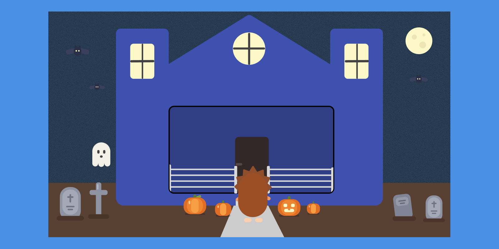
I wanted Angležko to dress up for Halloween. Orange, cobwebs on the buttons, bats across the screen. Nothing radical — half the apps in the world do it.
Then I thought about how you actually ship that.
You write the code, build a release, submit it to Apple and Google, and wait for review. Apple usually answers within a day, Google sometimes within three. If anything snags, seven. An app approved on 2 November is useless for Halloween — the night is over, and now you have a pumpkin-covered build in the store that you have to take back out. Which means another submission. And another wait.
Then you do it again for Christmas. And again for Easter. Two submissions every holiday: one to turn it on, one to turn it off.
That isn't a feature, it's a punishment.
The costume doesn't live in the app
What fixed it was to stop thinking of the skin as code and start thinking of it as content.
On launch, the app now asks my server a single question: which theme is on? The answer is a one-line file:
{ "style": "halloween", "status": "active", "version": 3 }
If it says default, nothing happens and the app looks the way it always does. If it says anything else, the app also fetches the description of that theme — which colours swap, which drawings go on the buttons, what hangs in the corners of the screen — and changes costume.
So Halloween turns on when I edit one word on a server. It turns off the same way. No build, no submission, no waiting on somebody in California.
What one file can describe
The theme description is plain JSON and it covers three things.
Colours. A partial palette — only the keys the theme actually changes. Background, cards, borders, text, accent, listed separately for light and dark mode. Anything you leave out stays as it was.
One colour is deliberately missing from that list: blue. Blue is Angležko. If a theme were allowed to replace it, then every October the app would stop being distinguishable from any other orange app — and the very thing that makes a holiday fun would cost me the thing people recognise.
Buttons and cards. This is the part I'm proudest of. There are hundreds of buttons in the app. Tagging each one by hand would have taken days, and I would certainly have missed ten of them.
So I replaced the plain Pressable with my own. With no theme it behaves exactly as before — nothing added, nothing slowed down. With a theme it measures itself: if it looks like a button or a card, it sticks one of the prepared decorations onto itself. A cobweb in the corner, a spider, a ghost, a small pumpkin.
The variants are handed out in creation order. That matters more than it sounds: if the decoration were picked at random, every re-render would reshuffle the deck and cobwebs would hop from button to button as you scrolled. This way each one gets its own and keeps it.
The overlay. Cobwebs in the corners of the window and bats across the sky. On a phone that's one drawing over the whole screen; on the wide web it's pieces pinned to the corners — a phone-shaped drawing stretched across a monitor would just look broken.
A background you dig through
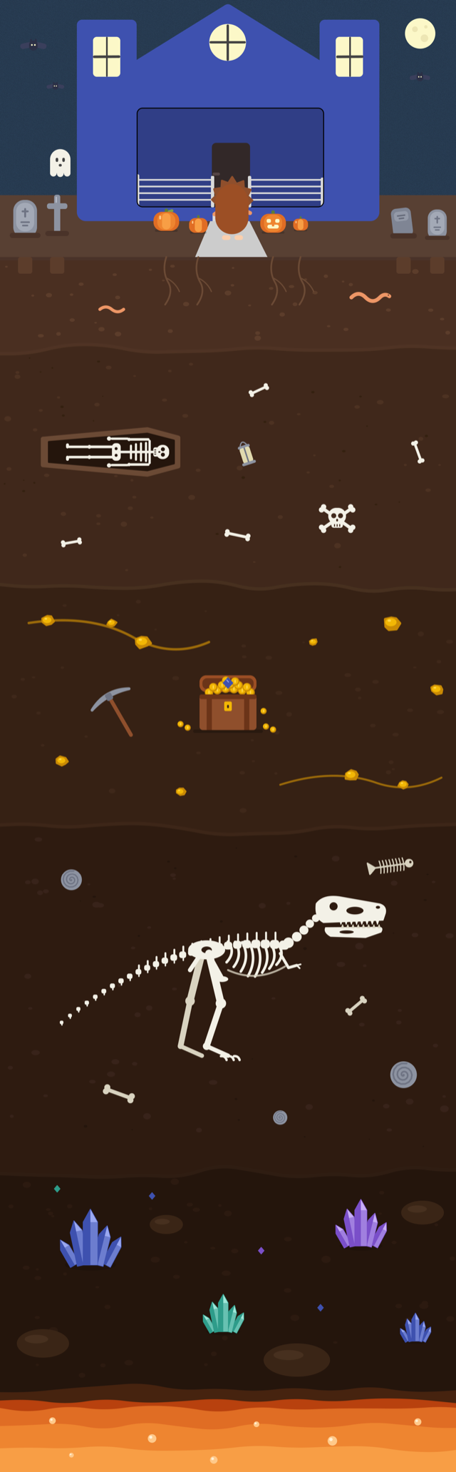
On the web, where the window is wide and the app sits in panels — menu on the left, content in the middle, cards on the right — there is a background behind them. In October it's a cross-section through the earth, three screens tall.
At the top, the school at night with pumpkins by the door. Below it soil and worms. Then a coffin and bones. Under that a seam of gold and a chest. Lower still a dinosaur skeleton, then crystals, and at the very bottom magma.
The drawing doesn't sit still. As you read it moves with the content — the further down the page you go, the deeper you are.
For any of that to stay readable, the panels above it are frosted glass: half transparent, with a blur. The blur matters more than the transparency here. Without it the edges of pumpkins and bones draw straight through the text and the eye reads them as a mistake; with it the scene under the panel melts into colour, stops being a shape, and leaves only a sense of depth.
The snag came somewhere I didn't expect. The obvious thing is to put the drawing inside the scroll container, since it has to move with it — but the panels' glass sits on that very container, and a drawing inside it would paint above the glass instead of below it. So it stays underneath everything and moves on its own: I pull it up by exactly as much as the content moves.
The rule that holds it together
The whole system rests on one rule: anything that goes wrong means the normal look.
No network — normal look. Corrupt file — normal look. Theme expired, server silent, drawing won't load — normal look.
That was deliberate and it cost me extra work, but it buys something worth every hour: there is nothing to roll back. If something dies, the user gets the app they know. Not half-orange, not blank, not broken. The way it was yesterday.
The last theme is also stored on the device, so the first paint doesn't wait on the network and the holiday survives bad wifi. The version number in that one-line file is what tells the app the stored copy is stale.
Why it was worth it
The system took a solid two days. It saves me two submissions per holiday, and there are at least four holidays a year.
But that isn't the real reason. The real reason is that I can now afford a holiday skin at all. As long as it cost a week of waiting and a risk of rejection, the answer to "should we do painted eggs at Easter?" was always no — not because it wouldn't be nice, but because it didn't pay.
Now the answer is one edited line. And when something is cheap, you actually do it.